
School display is often time-consuming and transient;
we should rethink it from first principles to expand pupils’ horizons.
I’m sceptical about a lot of display in schools. I often find it too crammed, too tiny or too noisily bedazzling; excruciatingly jargon-heavy, fleetingly transient, soon tattily dog-eared, and massively labour-intensive.
The consensus seems to be for the ideal display to be ‘in a constant state of interactive flux’; or at the least, ‘regularly updated’; these suggestions are comments on David Didau’s blogpost, What’s the point of classroom display?’ Refreshing display takes up lots of time every 3-6 weeks: time that could be spent on feedback or planning.
A lot of school and classroom displays resort to motivational jargon and meaningless platitudes. Stephen Covey makes a fine distinction in his anecdote:
‘I was deeply immersed in an in-depth study of the success literature published since 1776. I was reading literally hundreds of books, articles and essays. As my study took me back through 200 years of writing about success, I noticed a startling pattern emerging. I began to feel more and more that much of the success literature of the last 50 years was superficial. It could be called the personality ethic: full of social image consciousness, techniques and quick fixes. By contrast, almost all of the success literature in the first 150 years focused on the character ethic as the foundation of success: things like integrity, humility, simplicity, patience and hard work.’
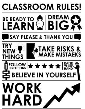
There is a lot of superficial, glittery, quick-fix, psyche-up, ego-boost gloss out there. I have fallen into that trap myself. Here are some psyche-up slogan posters I designed in my first year of teaching:


So, what does make school display effective? It starts with setting out its purpose.
For me, the purpose of school display is to expand students’ horizons, and help them live up to the ethos of the school. Wherever possible, it should be memorable and useful for students, and minimally labour-intensive for teachers. To this end, it is best where it is permanent, enduring and amplified.
Permanent, enduring, amplified
First, as much display as possible would be permanent, reducing time spent cutting, sticking and stapling, increasing teachers’ focus on planning and marking.
Second, we would display memorable, enduring and useful content, that teachers and pupils would actually use day-to-day.
Third, display would be amplified and simplified, by reducing non-essentials and applying the signal-noise ratio.
The signal-noise ratio is a concept that designers use. The best book on this is Presentation Zen, which practises what it preaches and beautifully amplifies its visuals by simplifying them. High clutter and excessive visual ‘noise’ strains pupils’ cognitive limits; simplicity allows pupils’ attention to be drawn to the essentials. Too much overloads; less is more on display.

Which enduring content to permanently display? Depending on the subject, threshold concepts; memorable quotations; great poems; great books; great writers; great leaders; great paintings; great monuments; great artists, composers, scientists, mathematicians; mountain ranges, rivers and oceans; maps, flags and timelines.
How can display be simplified and amplified? Here are some examples for whole-school rules: one voice, no excuses and classroom rules:


Checklists for routines: the legend Barry Smith suggests numbering the A1 routine posters round the room and then numbering the sequential steps on the poster: ‘Jack, poster 3, step 4, remember? If I say it, I mean it!’

Barry’s rules for developing poster content:
- Use posters to highlight the routines and habits you want in your classroom.
- Explicitly & habitually refer to posters every single lesson.
- A1/A0 size so all pupils can see every line.
- Number every point for unambiguous, systematic and easy reference for all.
- Number posters with separate cards so you can change poster positions easily.
- Number each poster in a clock-wise direction for easy reference.
Subject-specificity works, too: Barry suggests checklists for department-specific routines and habits, like reading, writing, speaking and listening activities in MFL. Mnemonics like SOHCAHTOA and Kris Boulton’s quadratic equation story could work well on display in a maths classroom. His idea of a list of strong reasons to answer the question: “why study maths?” would be good in other subjects, too. Keywords that unlock subjects spring to mind.

Publishers have already done a lot of great design work for us on book covers, and for the greatest books there are plenty of options to choose between:


I’d like to see a lot more great poems and speeches up:


Katie Ashford has used the prologue of Romeo & Juliet to great effect:

She has also impressively distilled the plot of Oliver Twist visually onto a single A1 poster:

When we taught Oliver Twist we had a poster up for each of the 15 episodes we taught as a powerful visual overview of the plot and characters.
Choosing quotations for school display is tricky as they can quickly blur into psych-up slogans: ‘THE SUN SHINES HERE EVERY DAY!’ ‘DARE TO BE GREAT’; superficially attractive but very hard to actually live up to in schools:


Instead, my litmus tests for quotations is that they are concise, punchy and pithy; enduring insights that have stood the test of time, spoken by an inspirational figure so that pupils are curious to explore into their lives; practically helpful in the day-to-day lives of pupils; and inspiring for staff, parents and visitors. That filters out quite a lot of more shallow slogans and quotations.
Some examples that I’d like to see displayed:


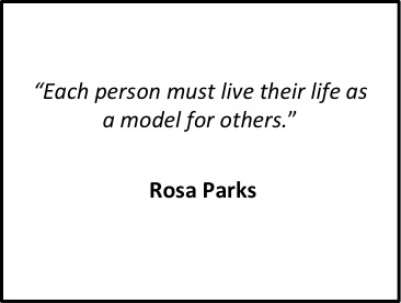


I can imagine using these ideas on difficulty, patience, excuses, persistence and others with pupils in the midst of lessons. And if it gets them curious as to who Epictetus or Florence Nightingale are, so much the better. They could be designed with images of the great thinkers who said them.
The promise of display is that it inspires pupils to expand their horizons. Rethinking it from first principles might help it to live up to that promise.
Great writing as always Joe. Displays are definitely one of my weakest areas – I find it so difficult to keep on top of it after the ‘Big Push’ to have an amazing classroom at the start of the year. It can be hard in some school contexts to discern who the display is ultimately for – it should be the kids, but a really child-centred display which puts the kids work at the heart of it (primary context here), is not always the most palatable sight when walking into a classroom.
Still, reading this has prompted me to have a rethink and get some new material up. Thanks!
Pingback: Great displays - Mark Anderson's Blog
Pingback: A guide to this blog | Pragmatic Education
Pingback: From transience to endurance: what makes school display effective? | Introvert problems
Pingback: 37 Ideas to Grow Gritty Learners by @Powley_R | UKEdChat - Supporting the Education Community
Pingback: Hornets and Butterflies: How to reduce workload | Pragmatic Education
Shame virtually all the images are now broken! Any chance of an update?
Pingback: Articles | Joe Kirby